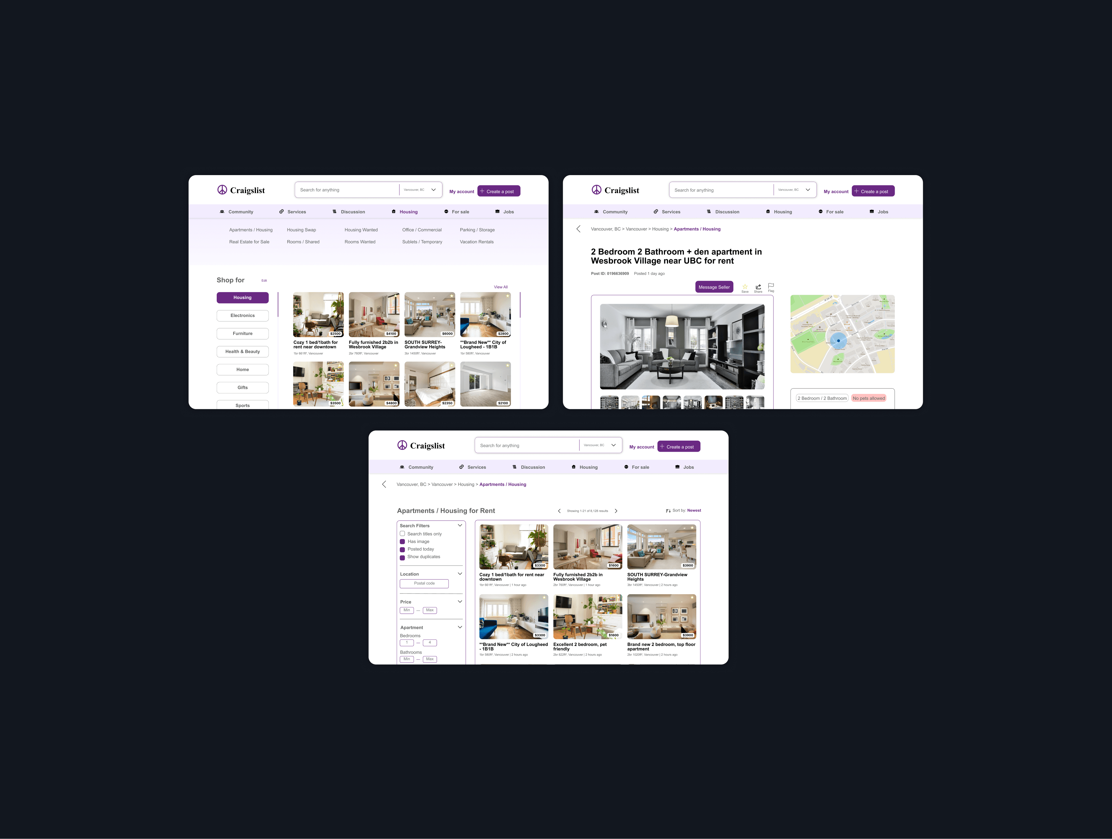
Enhanced visual hierarchy and visibility, modernized spacing and formatting.
Maximize the shopping experience with an established theme and content.
Efficient use of white space, reliable CTA location fixture.
With Craig Newmark's comments, I intended to explore the extent of the aesthetic-usability effect – a concept which suggests that aesthetic correlates to usefulness – and conversely, the inverted aesthetic usability effect.
I analyzed the buyer’s main user flow of looking for an apartment: Homepage → List of ads → Ad description.
From these 3 competitors, they all had what Craigslist lacked:
– Image-based personalized interface
– Clear hierarchy and organization
– Built-in messaging system
– Registrable accounts and profile verification
The customer demographic was mainly young adults, and over 60% being 35 or older. From interviewing both current and new users, the main insight was that current users have no problem since they no what to do, however, new users judged from the visual elements and didn't seem keen to proceed with the site.
Prioritizing new users with 'Craigsness'; it's not re-designing for the sake of designing, but rather to involve the upcoming community and the new users. It should still maintain its supreme usability for the current users, hence, the goals are:
1. Modern & formal
2. Simple & clean
3. Secure & verifiable
Most of the design ideas were finalized through A/B testing. Notable choices were including a top drop-down navigation menu rather than massive hyperlinks for categorization, color scheme & typography, and utilizing both horizontal and vertical scrolling to maximize white space.

